Get updates from The Developer straight to your inbox Yes, please!
“Buildings must speak to each other”
“It worries me as a Londoner when I see buildings that are soulless. How did they win planning? How did they get through?” An interview with Simon Silver, director at Derwent London

Derwent London has gained a reputation in architecture and development for stripping buildings back to their core structure and rejuvenating them, creating top-notch office space along the way for design-savvy tenants.
While they are not known for placemaking per se, wherever you stand in Fitzrovia, you are spitting distance from a Derwent London building. With a portfolio of 5.5m square feet, 98 per cent of which is in central London, Director of Derwent London, Simon Silver has a strong sense of how buildings contribute to the fabric of place.
“Cities are defined by their buildings,” says Silver. “It worries me as a Londoner when I see buildings that are soulless. How did they win planning? How did they get through?”
Their stylish refurbishment of down-at-heel offices such as the Tea Building in Shoreditch, or the Angel Building in Islington, not only renew individual buildings, but fast become a creative nexus for the neighbourhood.
To this end, handpicked tenancies on the ground floor are sometimes offered at reduced rates or long tenancies to creative tenants who will give the project an air of cool, such as an architecture practice or an art gallery.
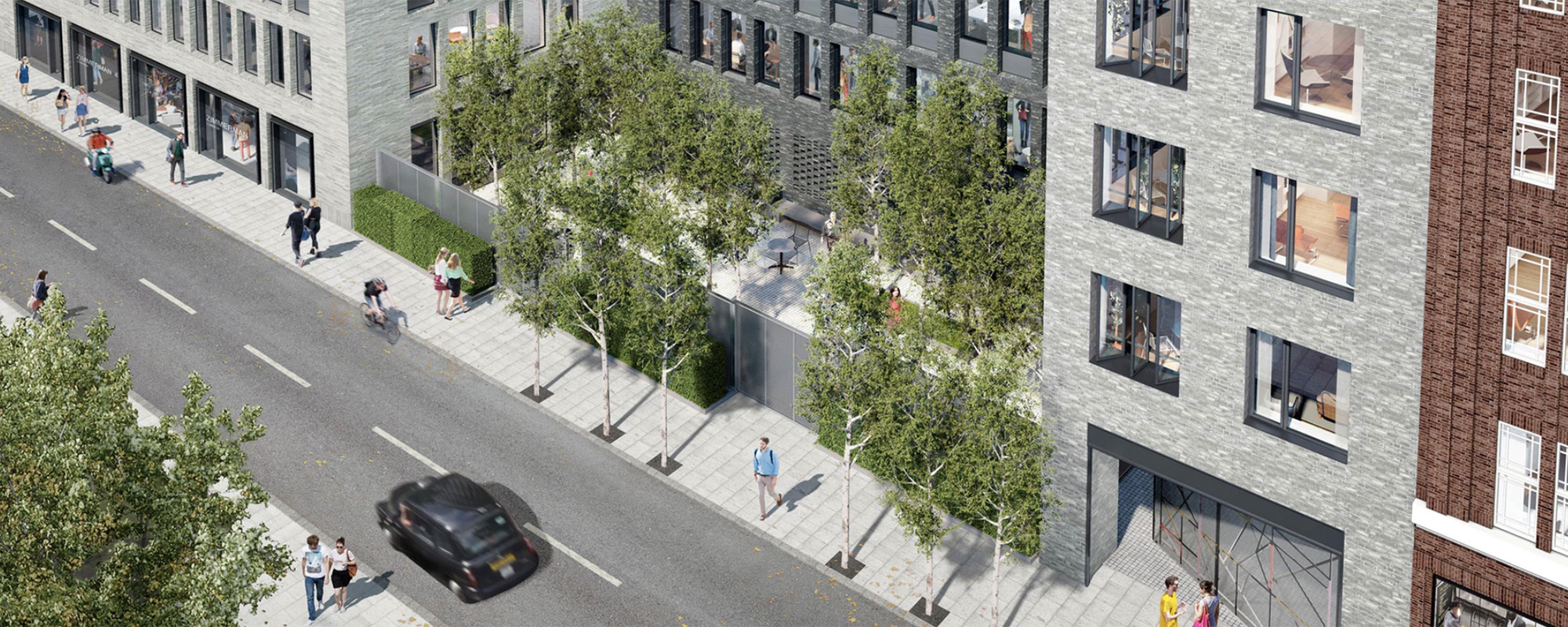
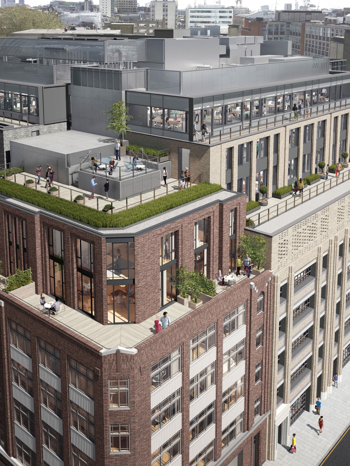
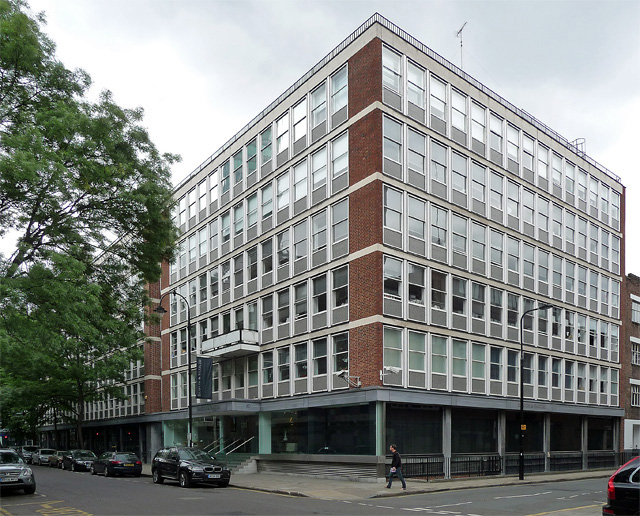
We are standing next door to their current construction project: the transformation of Saatchi & Saatchi’s vintage 1960s’ former premises at 80 Charlotte Street. The new building, designed by Make, looks nothing like the hulking original. The replacement will include a pocket park, a clutch of flats and mammoth floorplate offices for Boston Consulting Group and Arup. A patchwork façade in varied brick is designed to break up its scale.
“We often refer to our portfolio as being in a series of villages. The character of which – Soho, Bloomsbury – you want to retain. You don’t want to build a block that doesn’t speak to that area. I’m very confident that those who live and work here are not going to say, ‘Oh no, not another big office building’.”
“Planners should give developers like us a tough time. Once a building is built, it’s got to stand the test of time”
But despite its external appearance, it is a big office building – the biggest development Derwent London has ever done, in fact. “It’s 360,000 square feet, plus 21 flats for letting, because we wanted to retain ownership of them. There’s retail and galleries as well.”
The pocket park, designed by landscape architects Del Buono Gazerwitz is another first; a planning concession to Camden Council, which wanted a green space in the centre of the development. “To put a small area in the middle of our development takes away so much value that it makes it implausible,” says Silver of the negotiation.
“We went back to Camden and offered a cut in the building – we’re talking millions of pounds in value given back to anyone in the neighbourhood who wants to wander in.”
The pocket park is inspired by a trip to New York to visit Paley Park, a 1967 privately owned pubic space in Midtown Manhattan, designed by Zion Breen Richardson Associates and widely considered one of the finest urban spaces in America.
Silver gives “credit to the London Borough of Camden” for the pocket park idea. “They said any new development should give something back.”
“Planners should give developers like us a tough time. They should be very demanding of what we’re going to do. Once a building is built, it’s going to stand there for many, many years. It’s got to stand the test of time.”
Silver is shocked by some of the architecture that has been permitted in London, in particular what he describes as “soulless buildings” of glass and steel that have nothing of the London vernacular of brick and stone: “Particularly big glass buildings that are not very well articulated.
“Near the Tea Building, a few apartment blocks have gone up that have nothing to do with Shoreditch. Residential buildings especially will stand for 125 years at least. Once they are up you are never going to say goodbye to them: more attention should be paid.”
Silver recognises developer Argent for the quality of its work: “One of the best developments that I’ve ever seen is King’s Cross because you’ve got a marvellous selection of buildings; a mixture of old and new.”
“Paddington, sadly, doesn’t have that,” Silver adds. “It misses slightly. I hope our [Brunel] building [designed by Fletcher Priest] will revive it and give it a bit of gravitas. Without being too disrespectful to other developers, some of the buildings stand shoulder to shoulder but just have nothing in common.”
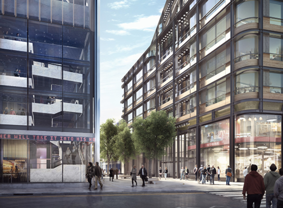
The Brunel Building is a departure for Derwent London, whose new-build structures are increasingly daring. Take, for example, the Jean Prouve-inspired White Collar Factory by AHMM on Old Street roundabout. The Brunel features a splat of load-bearing steel rails across its facade, this is icon architecture, not a quiet addition.
Silver says the building is a deliberate reference to the rail heritage of the place. He believes buildings should “speak to each other” and says for this, the materiality of the building is key.
“Brick! Portland stone! All wonderful materials,” Silver says. “It’s down to planning. You’ve got to give a strong design brief and make sure it works. I’m being slightly critical, but there are parts of London where it absolutely doesn’t work, and that’s sad.”
“We should stick to brick and stone in a contemporary form. We don’t want pastiche – we want to go forward and create the next best thing.”
“We’ve got amazing talent out there. But I do think the planning authorities when they have these big tracts of land need to have a great masterplan. With a great masterplan, you’ll get great buildings.”
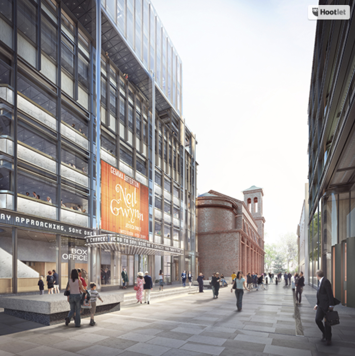
Derwent London is about to step more directly into placemaking with its project to replace the Astoria building on Charing Cross Road. Their Soho Place project will start on site this year and includes a piece of public realm and the first new West End theatre in 40 years.
“Soho Place is an amazing opportunity for us. With all the developments we’ve done over the years, this one offers a bit of everything. It also gives us the opportunity to placemake: when you have a piece of public realm, you’re giving something back, and that is a privilege to be involved in.”
The project is not without its challenges - many objected to the loss of the original Astoria building: “People are very romantic about the old Charing Cross Road, and I understand why,” Silver says, reflecting. “But it was also very down-at-heel, and a lot of the buildings were pretty miserable.”
“London is famous for its culture. It’s what gives the city its buzz”
When I ask Silver to indulge in a bit of future-gazing, high design, well-being and informality are key trends in office design, especially in the City, which has traditionally offered stuffy, standard fare.
“The Ned has been transformational,” Silver says, speaking of the buzzing mixed-use complex of restaurants, bars, members club and five-star hotel located in the former Midland Bank near the Bank of England. “Now people designing in the City are being asked to make it more like Clerkenwell. Change is afoot.”
Silver also says companies in general are increasingly savvy about interior design, demanding attractive lobbies and break-out areas, and sensitive to volume and light. “Tenants are far more fussy than they used to be.”
“In order to attract talent, companies have realised that you have to have great offices that you’re happy to work long hours in. You’ve got to have lounges and a great canteen, and there’s no doubt it increases productivity.”
I ask Silver whether this informality should extend into public realm, now that office workers are just as likely to check their emails in the park. In the public realm around offices, formal hard landscaping is still the norm, as seen in One Pancras Square.
Silver finds the idea interesting, but sticks to his expertise - how to make workers feel when they step inside:
“The thing that we give them is volume,” says Silver. “We always try to create spaces that are at least three metres high, from floor to ceiling. When you walk into that space, you feel good.”
“Sacrificing square footage to create better quality square footage is a lesson we learned early on,” says Silver.
“I want employees to be lifted by the space. You feel happy going back to work.”
Listen to the full interview in the podcast below by clicking on the link and sign up to The Developer Weekly to be updated when new episodes go online.
Sign up to our newsletter
Get updates from The Developer straight to your inbox
Thanks to our organisation members
Become a member
© Festival of Place - Tweak Ltd., 124 City Road, London, EC1V 2NX. Tel: 020 3326 7238
